Visual Proof Of Global Cooling Since 2007
During the autumn and winter of 2007 I took the opportunity of printing out a selection of maps from this site:
http://www.wetterzentrale.de/pics/Rtavn125.html
The maps show the temperature of most of the northern hemisphere centred on the North Atlantic and cover the bulk of the northern hemisphere land masses and the northernmost section of the Atlantic Ocean.
The significance is that one can readily observe the extent and intensity of the cold air covering the northern high latitudes as a whole at the time and date of each map.
The volume and intensity of cold polar air is dependent on the level of solar energy received into the Earth system and the rate at which the oceans release absorbed solar energy to the air. There is little variation overall from year to year because solar intensity varies very little and the oceans take many years to alter their rates of energy release as witness the 60 year cycle of the Pacific Multidecadal Oscillation.
There is a good deal of variability around the edges of the polar air masses but at any given time those regional variations even out.
In order to ascertain whether there is a global warming or cooling trend it is necessary to wait several years and then compare the volume and intensity of the cold polar air masses as a whole between the dates chosen. In this case I have chosen the years 2007 and 2011.
The features to look out for are the extent of regions which are purple and black and the latitudinal positions of the various isotherms. Note that we are looking down on vast areas so even small regions that have become colder are of significance yet even over the period of a mere four years we see that in fact large regions are apparently affected by increased cold since 2007.
Within this article I have provided several pairs of maps for the same date and time in each of the years 2007 and 2011.
It is obvious to me that the isotherms have moved equatorward both over land and oceans and that the intensity of cold where it is most readily generated has increased, especially over the Greenland icecap and Northern Russia.
That is not what we have been led to expect.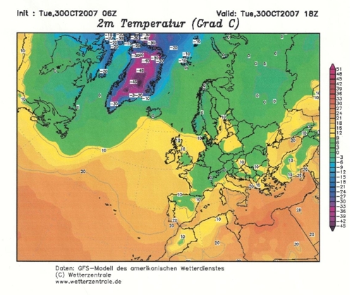
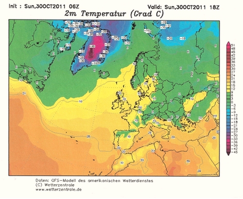
Points of Difference 30th October 2007 and 2011:
i) In 2011 in the west the area below 7.5C (green) has extended beyond the chart boundary and in the east has extended around the Black Sea.
ii) Blue areas have appeared over northern Russia which were absent in 2007.
iii) The orange area between 15C and 17.5C has retreated equatorward to the west of the UK.


Points of Difference 26th November 2007 and 2011:
i) The most obvious feature is the large area of purple and black over Greenland which was almost entirely absent in 2007.
ii) Northern Russia is a good deal colder in 2011 as is the Black Sea area.
iii) 2011 is a little less cold over the Hudson Bay area but that is compensated for by the patch of purple and darker blue in the Canadian Arctic.
iv) Iceland is well within the 10C isotherm in 2011 indicating a cooling effect spreading out from Greenland but the North Sea is a little warmer in 2011 due to the yellow area that was near Iceland in 2007 having toppled across the UK.
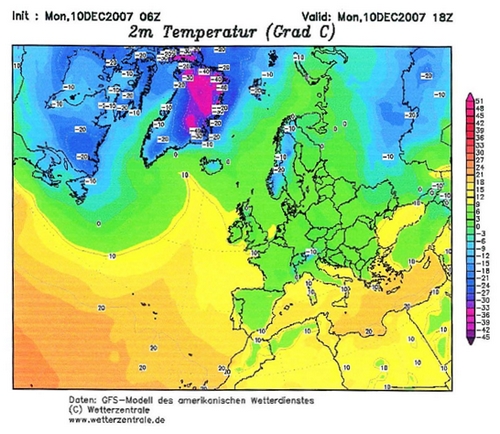
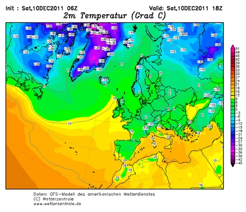
Points of Difference 10th December 2007 and 2011:
i) The area of purple over Greenland and the Canadian Arctic is much larger in 2011.
ii) Northern Russia is much colder with a patch of purple in 2011.
iii) The 20C isotherm over the North Atlantic is further south westward in 2011.
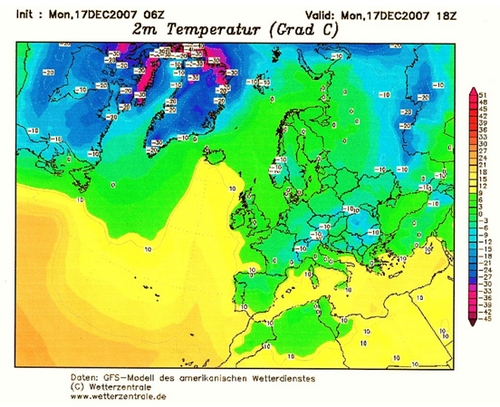
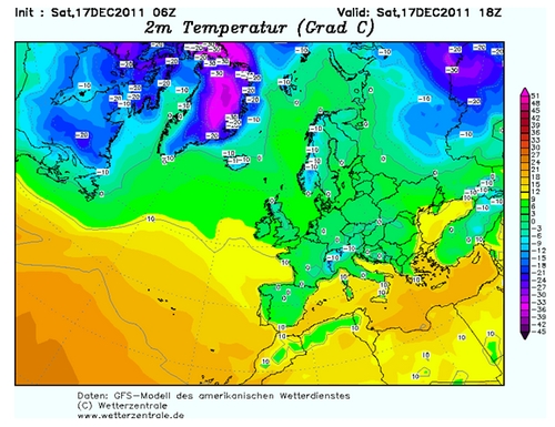
Points of Difference 17th December 2007 and 2011:
i) The 10C isotherm has moved a long way equatorward west of the UK
ii) Much more purple in 2011 in Greenland and northern Russia.
iii) The 0C isotherm has extended out from Greenland beyond Iceland.
Conclusion:
There would appear to have been a clear cooling trend in the northern hemisphere around the pole since at least 2007 and most likely for longer.
The polar air masses are getting colder and expanding, contrary to expectations. That is likely to be the reason why there have been a number of notable incursions of cold air into middle latitudes in recent years. Such events have been occurring in both hemispheres so it is likely that the observed cooling trend is occurring at both poles.
It is a fundamental tenet of anthropogenic global warming theory that the poles warm more than other latitudes. Instead, what we can see here is the poles cooling and exporting cold air and colder ocean water towards the equator.
It may well be that the practice of interpolating estimated temperatures in the uninhabited polar regions is inappropriate and has been delaying our realisation that in fact global cooling is now in progress.
Published by Stephen Wilde December 11, 2011